
Consulting, convening, coding, covering new ground, plus occasional commentary.
covering
Slacker lesson No. 2: Work with truly fscking great designers

Lately I’ve been pretty lucky in terms of working with talented designers: most recently, working with Alex Grunenfelder at The Tyee on Style Tiles for a new project, and Cristian Fleming from The Public Society on Beautiful Trouble. Working with people like this, I viscerally understand the difference between a good designer, and a truly great designer.
I’m fortunate to have had the opportunity to collaborate with some pretty amazing graphic designers over the years, but it’s been rare for me to work with a designer who really, really gets the Web too. Thus, another memorable highlight was working with Andy Clarke on the New Internationalist re-design in 2009. We had some fun back-and-forth discussions about CSS frameworks as he blogged the whole exercise. It’s fun to keep bumping into Andy’s name, on projects like 320 and up.
A few weeks ago I started working with a new designer, Adrienne Conley, who’s part of the super-impressive volunteer team supporting the Ryan Meili campaign for leadership of the Saskatchewan NDP.
The task for us was to create an Obama-esque splash page for Ryan’s campaign site that focused on collecting visitor’s e-mail addresses into Nation Builder for follow-up.
A quick look at the analytics showed that a growing number of visitors were arriving at the site on a variety of mobile devices: smartphones, tablets, Blackberrys, and so on. So we decided early on to develop a responsive splash page that would work across screen sizes.
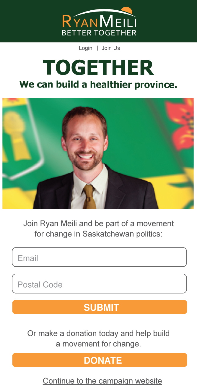
Instead of the Style Tiles approach that we experimented with recently at The Tyee, Adrienne provided me with simple designs at two reference sizes – 1200 x 800px (shown above) and 320 x 480px – and stuck to Web- and mobile-friendly typography (Tahoma and Arial in this case).
The designs that Adrienne delivered were perfect: both eye-pleasing and modular, and with enough visual freedom that I could improvise at all of the various breakpoints. The result, should you want to try it out, is here.
What I really got me stoked about this little project was the opportunity to develop my own personal boilerplate CSS for the common mobile breakpoints. On projects like Beautiful Trouble and Occupy America, I was developing on top of Twitter’s Bootstrap framework for speed and convenience. However, for a simple splash page, using something like Bootstrap would have been overkill. Starting from scratch with the HTML5 boiler plate for the page structure and a blank CSS file really gave me a chance to start mobile first and then build the page up to the large screen sizes (in this case, by picking and choosing what I wanted from Boostrap’s responsive tools).
Things have come a long way, given that I probably started experimenting in earnest with responsive Web design ideas in February 2011 when I stumbled on Joni Korpi’s Less Framework; a year-and-a-half later, I’m pulled between two ends of a very-distant spectrum: at one end is the idea that the future of a responsive Web lays in Typography, at the other end lies a global network of device labs. Both are appealing for entirely different reasons.
But, at the end of the day – responsive or not – working with a truly fscking great designer makes makes it that much easier to slack off and noodle the bigger questions in life (“Typography?” “Device Lab?” …).
About
Hi, I'm Phillip Smith, a veteran digital publishing consultant, online advocacy specialist, and strategic convener. If you enjoyed reading this, find me on Twitter and I'll keep you updated.
Related
Want to launch a local news business? Apply now for the journalism entrepreneurship boot camp
I’m excited to announce that applications are now open again for the journalism entrepreneurship boot camp. And I’m even more excited to ...… Continue reading
Previously
Slacker lesson No. 1: Hire a truly fscking great hosting company
From the future
Beautiful Trouble descends on Oaxaca (again)